Joel Carlson Data Scientist
Exploring the Median Cut Algorithm with R
The median cut algorithm is a method for discretizing a continuous color space. That is, taking an image that consists of many colors, and reducing it into fewer colors. Broadly, the idea is to take the red, green, and blue components of an image, visualize each of them as an axis in 3-dimensional space, and then partitioniong that space into chunks, each consisting of as few distinct colors as possible. Here, we will explore and implement the median cut algorithm in R.
The implementation here, with some modification, is available in the RImagePalette package, and can be explored interactively here!
Let’s start by coding a graphical representation of this 3-dimensional RGB color space. We will work throughout this post with a colorful image of a delicious and healthy snack:
library(ggplot2);library(ggthemes)
library(knitr); library(scatterplot3d)
img <- jpeg::readJPEG("celery.jpg")grid::grid.raster(img)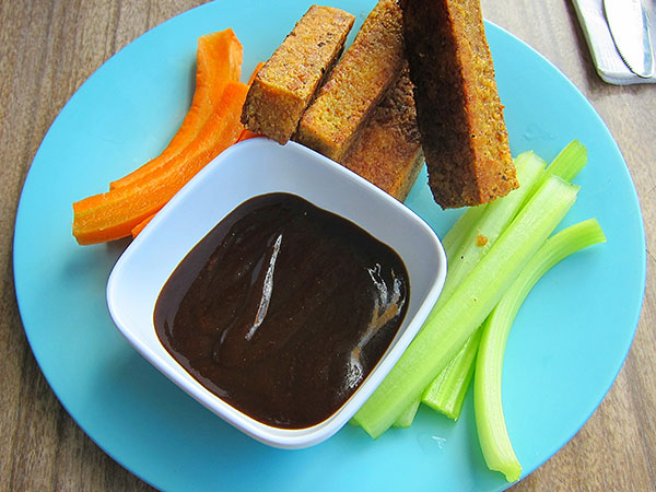
It’s going to be convenient to work with the image as a list of three 2D matrices, rather than a single 3D matrix, so we will split it and name each matrix appropriately:
img_list <- list("Red"=img[,,1], "Green"=img[,,2], "Blue"=img[,,3])Let’s look at how the values in each of the R, G, and B components are distributed:
# Create a tall dataframe
component_distribution <- data.frame("value"=255*c(c(img_list$Red),
                                                   c(img_list$Green),
                                                   c(img_list$Blue)),
                            "Color"=factor(rep(c("Red", "Green", "Blue"),
                                       each=length(img_list$Red)),
                                       levels=c("Red","Green","Blue")))

ggplot(data=component_distribution, aes(x=value, fill=Color)) +
    geom_histogram(binwidth=10, aes(y=100*(..count..)/sum(..count..))) +
    facet_wrap(~Color) +
    theme_pander() +
    guides(fill=FALSE) +
    labs(x="RGB Value (0 - 255)", y="Percent (%)") + #hist labs
    scale_x_continuous(breaks=c(0,50,100,150,200,255)) +
    theme(strip.background = element_blank(),
     strip.text.x = element_blank())
We note several things:
- The distributions of each color each have a unique shape
- Certain color values are more present in the image than other colors
It will be our task to extract those colors which are most highly represented in the image. This is where the median cut algorithm comes in.
The Median Cut Algorithm
The median cut algorithm can be stated as follows:
- Create a “cube” of the colors in the pixels of an image by using each color component (R, G, and B) as an axis (e.g. x,y,z)
- A: Calculate the range of each color component (R, G, and B)
- B: For the component with the largest range, C, calculate the median value, M
- C: Split the “cube” of colors:
- one cube containing the RGB values of all pixels where the C component is greater than M
- one cube containing the RGB values of all pixels where the C component is less than M - D: If the number of cubes is equal to our chosen number of desired colors, exit the loop - E: For each color cube, calculate the range of each component, choose the cube which containts the largest range, and repeat
- For each cube, apply some function (mean, median, mode, etc) to the value of each component, and combine into a new RGB value
Let’s walk through this for our chosen image.
Walking Through the Median Cut
Step 1:
We first create a cube of the RGB components. A sample of 2500 pixels from the image along the R, G, and B axes is visualized using the code below:
color_plot <- function(img_list, n_points, main=""){
  set.seed(101)
  dims <-length(img_list$Red)
  point_sample <- sample(1:dims, n_points)

  img_matrix <- t(matrix(c(img_list$Red[point_sample],
                           img_list$Green[point_sample],
                           img_list$Blue[point_sample]
                           ),
                   nrow=3, byrow=TRUE,
                   dimnames=list(names(img_list))))

  scatterplot3d(img_matrix, color = rgb(img_matrix),
                main = main,
                pch = 16,box=FALSE, angle=20,
                y.margin.add=0.1,
                xlim=c(0,1),
                ylim=c(0,1),
                zlim=c(0,1),
                x.ticklabs=c(seq(0,200,50), 255),
                y.ticklabs=c(seq(0,200,50), 255),
                z.ticklabs=c(seq(0,200,50), 255))
}color_plot(img_list, 2500, "Original")
In the image we can get an idea of the most common colors present in the image. The blue in the upper are from the plate, the orange in the bottom from the carrots, etc.
Step 1A - Calculate the Range of Each Component
To choose how to split this cube up, we require the range of each component. Since we will be doing this a number of times, we will write a convenience function:
range_table <- function(images){
  #each item in the list is a 3 dimensional image matrix
  ranges <- lapply(images, function(img){
                 list("Red" = paste(255*range(img$Red), collapse=" - "),
                      "Green" = paste(255*range(img$Green), collapse=" - "),
                      "Blue" = paste(255*range(img$Blue), collapse=" - "))
            })
  kable(do.call(rbind.data.frame, ranges), format="html")
}

# Check ranges of original image
range_table(list("Original"=img_list))| Red | Green | Blue | |
|---|---|---|---|
| Original | 0 - 255 | 0 - 255 | 0 - 255 |
Step 1B - Median of the Component with the Largest Range
In this case, each axis extends from 0 to 255. Since there is no single component with the largest range, me must make a choice. There are a number of different methods for making this choice, however for simplicity we will choose randomly. Let’s arbitrarily choose the red axis.
cut_color <- "Red"
median(img_list[[cut_color]]) * 255
## [1] 118Step 1C - Split the Cube Along the Median
Iteration 1
Using the median we calculated in Step 1B, we will extract all of the pixels from the original image above, and below that value:
# Define the median cut algorithm
median_cut <- function(img_list, cut_color, cube_names){
  lst <- list()

  #Extract from each component:
  #all pixels where cut_color is above the median value
  lst[[cube_names[1]]]  <- lapply(img_list, function(color_channel){
    color_channel[which(img_list[[cut_color]] >= median(img_list[[cut_color]]))]
  })

  #all pixels where cut_color is below the median value
  lst[[cube_names[2]]]  <- lapply(img_list, function(color_channel){
    color_channel[which(img_list[[cut_color]] < median(img_list[[cut_color]]))]
  })

  return(lst)
}

# Perform the median cut on the image
img_list <- median_cut(img_list, "Red", cube_names=c("Cube 1","Cube 2"))par(mfrow=c(1,2))
color_plot(img_list[["Cube 1"]], 1250, "Cube 1")
color_plot(img_list[["Cube 2"]] ,1250, "Cube 2")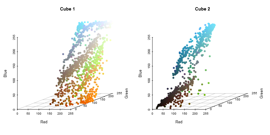
Step 1D and Step 1E - Calculate Range of Each New Cube
We now have two cubes, each with their own distribution of colors, and each with a different dominant color. We will go on in this post to extract 6 colors from the image, so we need to repeat the process. To choose the next cube to cut, we calculate the ranges of pixels in each cube:
range_table(img_list)| Red | Green | Blue | |
|---|---|---|---|
| Cube 1 | 118 - 255 | 0 - 255 | 0 - 255 |
| Cube 2 | 0 - 117 | 0 - 243 | 0 - 255 |
The maximum range out of any of the components is still 255, and both cubes have at least one axis that covers the full range. Again, we arbitrarily choose, randomly selecting Cube 2.
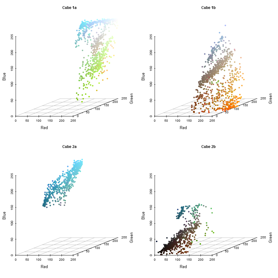
Loop Back
Iteration 2
In Cube 2, we select the component with the largest range to cut across, in this case, the Blue axis:
cut_color <- "Blue"
median(img_list[["Cube 2"]][[cut_color]]) * 255
## [1] 132# Keep uncut cube (Cube 1), perform median cut on Cube 2
img_list <- c(list("Cube 1" = img_list[["Cube 1"]]),
median_cut(img_list[["Cube 2"]], "Blue", c("Cube 2a", "Cube 2b")))
range_table(img_list)| Red | Green | Blue | |
|---|---|---|---|
| Cube 1 | 118 - 255 | 0 - 255 | 0 - 255 |
| Cube 2a | 15 - 117 | 53 - 243 | 132 - 255 |
| Cube 2b | 0 - 117 | 0 - 217 | 0 - 131 |
We are left with three cubes now, still not the desired 6, so we need to repeat the algorithm 3 more times. I will spare you the code (although you can see it in the reproducible document), and present the plots. The next cut will be along the Green axis of Cube 1, which has a maximum range of 255.
Repeat
Iteration 3
Iteration 4
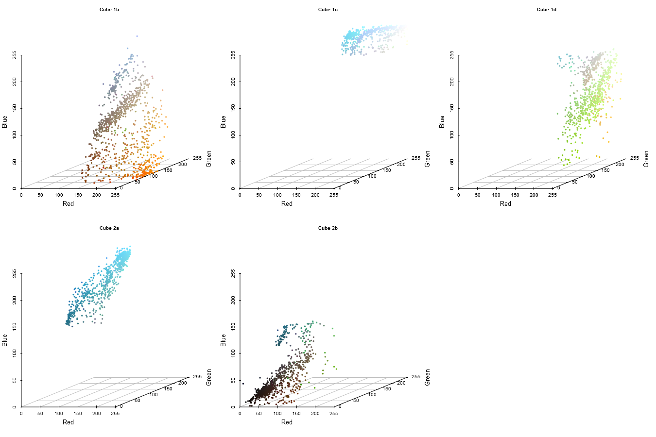
Iteration 5
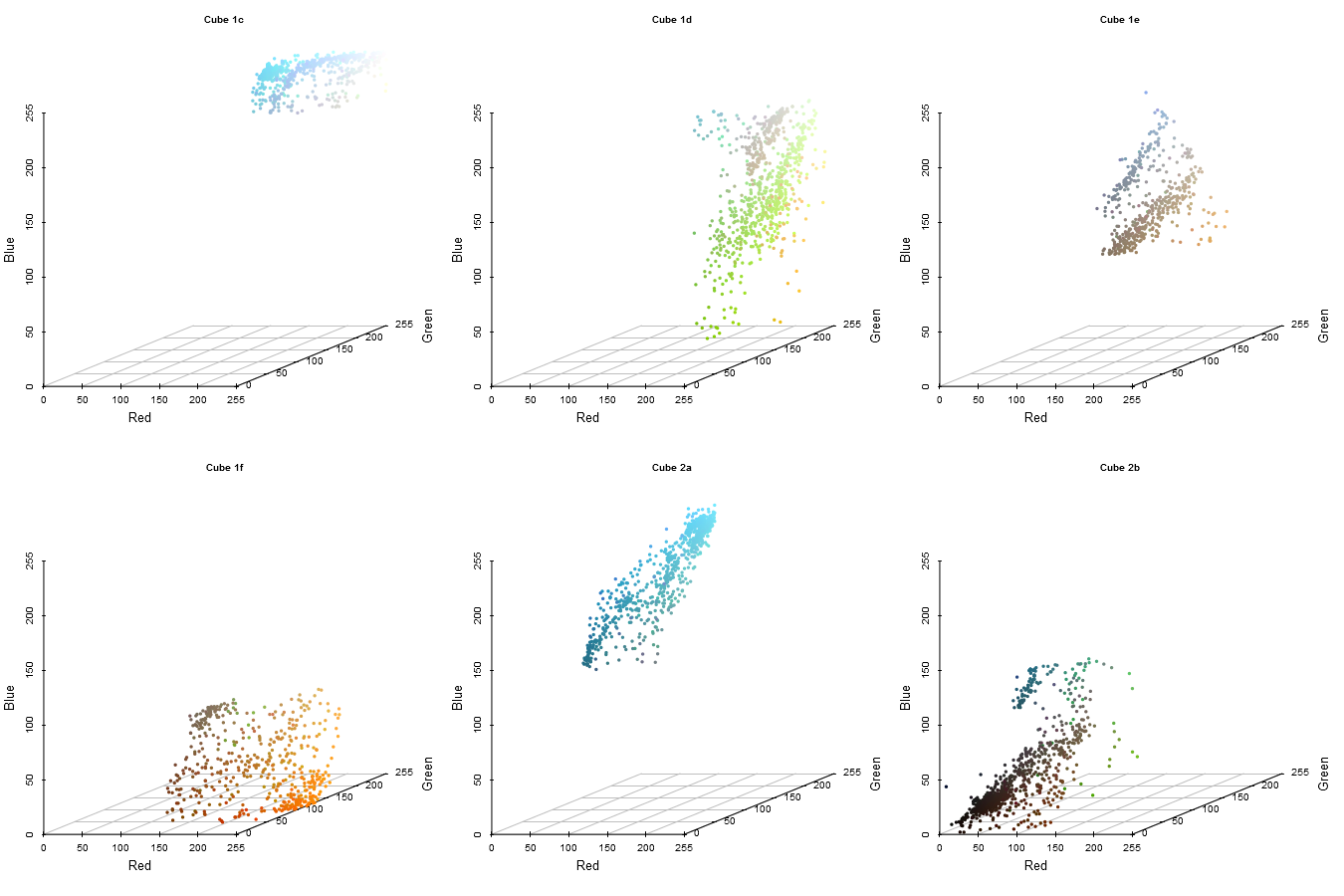
And we are now left with 6 cubes, each of which we wish to extract the dominant color from.
Step 2 - Extracting the Colors
Finally, we have the desired number of colors, and can exit the loop!
We have 6 color cubes now, each representing a different set of colors. Ideally, each cube contains a relatively distinct set of colors, but in practice it may take a larger number of iterations for the cubes to be small enough. To extract the color that each cube represents, we must apply some sort of color extraction function to each cube. For this, we have several options:
- Extract the mean R, G, and B value from each cube, and combine them into a single RGB value
- Extract the median R, G, and B value from each cube, and combine them into a single RGB value
- Extract the most common R, G, and B value from each cube, and combine them into a single RGB value
- Convert each R, G, B set into a hex value, and extract the most common value (this ensures that the extracted colors are present in the image)
Below, the final option is demonstrated, and the extracted palette visualized:
# Who could believe there isn't a mode function in R?
Mode <- function(x) {
  ux <- unique(x)
  ux[which.max(tabulate(match(x, ux)))]
}

choice=Mode

# see reproducible doc for show_colors() code
show_colors(unname(unlist(lapply(img_list, function(x) rgb(choice(x$Red), choice(x$Green), choice(x$Blue)) ))), labels=TRUE)
Conclusion
The extracted palette represents the dominant colors in the image quite well. We can see the sauce, the plate, the background, celery, and carrot colors are all present in the final palette. To note, I have implemented the median cut algorithm in an R package, RImagePalette. Using the package to produce palettes from images is super easy!
library(RImagePalette)
set.seed(1)
show_colors(image_palette(img, 9, Mode)) |
|
|---|
Happy extracting!